I like what you did with the manip part, those images work really well together. My only critque -- and this may just be me showing my age -- is that the washed-out pastels, while giving it sort of a beachy feel, are really bright and I can't look at them for more than a few seconds. But again, that may just be a personal vision issue.
Well either way I love what you did with the manip. It's very inspiring in a 'go write that damn fic you've been avoiding for two days instead of messing about with php' vein.
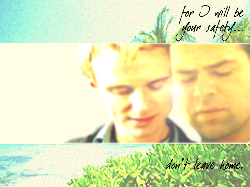
Guh. I love it! I love that picture of Brian. You did really good with the light issues that come up whenever you've got images of differing quality. It kind of gives me the impression that they could be standing under an awning or some such with Tyler getting the brunt of the sun's glare and Speed just getting a bit. I also really like the background you've got going on, it's all Miami-ish. And the text is perfect for them. heh. So, yeah, I really like it. I'm so proud that my junk inspired you to make this. Yay us!
Also? That manip might make a nice icon. ::does not throw giant boulder-shaped hint at you::
::pets:: It'll be okay, sugar. Photoshop is a bitch sometimes. I'll live without the icon, it was just like a 'if you want to/can do it, it would be cool' type thing.
Please don't hurt me. I'll stop being mean to myself and my "art". I'm glad you guys like them as much as you do. When I look at anything I make I mostly just see all the things I wanted them to be. ::sniff:: Yeah.
![[personal profile]](https://www.dreamwidth.org/img/silk/identity/user.png) carleton97) wrote2004-03-06 01:48 am
carleton97) wrote2004-03-06 01:48 am![[livejournal.com profile]](https://www.dreamwidth.org/img/external/lj-userinfo.gif) justmightbe's desktops, I decided to try my hand. It's my first attempt, so let me know what I can do to improve.
justmightbe's desktops, I decided to try my hand. It's my first attempt, so let me know what I can do to improve. 
no subject
no subject
no subject
no subject
no subject
no subject
no subject
Also? That manip might make a nice icon. ::does not throw giant boulder-shaped hint at you::
no subject
I <3 your icon, btw.
no subject
Thanks. heh.
no subject
I'm cranky.
no subject
no subject
myyour Speed/Tyler backgrounds 'junk' I am going to have to fly to Florida and hurt you. Just so you know.no subject
no subject